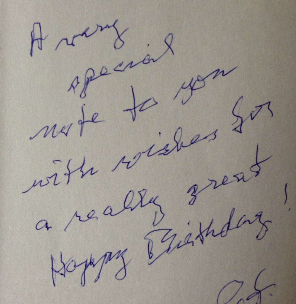
When my mom turned 78 over the summer she got the birthday note above from a 70-something friend of hers. The writing gets me thinking about the design of Planned Giving reply cards so that your elderly prospects can use them.
It’s timely because we’re in year-end mode.
The thoughtful note is written by a shaky hand that requires extra space to be legible. That means your reply cards need to have lots of vertical and horizontal space if you’re asking people to fill in their name, address, etc.
The best practice–and the one I urge my clients to adopt–is to send personalized reply cards. The name and address are laser printed, either after the card is printed in bulk or at the same time.
But you may ask prospects for their email or phone, even on a personalized card. Leave lots of space between lines (horizontal) and make the space large vertically.
If a mail house prepares your postal mailings, personalizing reply cards adds to your expense. Where you hopefully had a double match, between outer carrier envelope and letter, you now have a triple match. That costs more. (I say “hopefully” because no Planned Giving letter should be addressed to friend, sir or madam, or anything other than the prospect’s name. I said a lot more about writing letters in two posts for GuideStar here and here.)
If you prepare your mailings in-house or can’t afford the expense of the triple match, design your reply card with plenty of space for elderly hands that may be afflicted with arthritis, nerve damage, be painful, shake or just need lots of room to write.
This is but a small part of focusing on the needs of your Planned Giving prospects and donors.
It will be appreciated.
